<div class="odubu-wrapper">
 <!-- Header -->
 <header class="odubu-header">
  <nav class="nav-links">
   <a href="#">
    About Us
   </a>
   <a href="#">
    What We Do
   </a>
   <a class="active" href="#">
    Our Selected Wörks
   </a>
  </nav>
  <div class="logo-header">
   Ödubu
   <br/>
   design
  </div>
  <a class="btn-connect" href="#">
   Let's connect
  </a>
 </header>
 <!-- Main Card -->
 <main class="main-card">
  <div class="floating-bg">
   <!-- Star shape -->
   <svg class="bg-shape shape-1" viewbox="0 0 100 100">
    <path d="M50 0 L60 40 L100 50 L60 60 L50 100 L40 60 L0 50 L40 40 Z" fill="var(--primary)">
    </path>
   </svg>
   <!-- Circle/Cloud shape -->
   <svg class="bg-shape shape-2" viewbox="0 0 100 100">
    <circle cx="50" cy="50" fill="var(--primary)" r="50">
    </circle>
   </svg>
   <!-- Another Star -->
   <svg class="bg-shape shape-3" viewbox="0 0 100 100">
    <path d="M50 0 L60 40 L100 50 L60 60 L50 100 L40 60 L0 50 L40 40 Z" fill="var(--primary)">
    </path>
   </svg>
  </div>
  <div class="hero-text-container">
   <!-- Animated Ö -->
   <svg class="animated-o" viewbox="0 0 150 150" xmlns="http://www.w3.org/2000/svg">
    <!-- Left Eye -->
    <path d="M 23 25 C 23 9 47 9 47 25 C 47 41 23 41 23 25" fill="none" id="eye-left" stroke="var(--primary)" stroke-linecap="round" stroke-linejoin="round" stroke-width="12">
    </path>
    <!-- Right Eye -->
    <path d="M 93 25 C 93 9 117 9 117 25 C 117 41 93 41 93 25" fill="none" id="eye-right" stroke="var(--primary)" stroke-linecap="round" stroke-linejoin="round" stroke-width="12">
    </path>
    <!-- Face Base -->
    <circle cx="70" cy="90" fill="var(--primary)" r="50">
    </circle>
    <!-- Animated Mouth -->
    <path d="M 50 75 C 50 110 90 110 90 75 C 80 95 60 95 50 75" fill="var(--bg-card)" id="mouth" stroke="var(--bg-card)" stroke-linecap="round" stroke-linejoin="round" stroke-width="10">
    </path>
   </svg>
   <!-- Remaining Text -->
   <span class="dubu-text">
    <span class="char-wrapper" style="transform: rotate(5deg) translateY(10px);">
     <span class="char">
      d
     </span>
    </span>
    <span class="char-wrapper" style="transform: rotate(-8deg) translateY(-5px); margin-left: -5px;">
     <span class="char">
      u
     </span>
    </span>
    <span class="char-wrapper" style="transform: rotate(8deg) translateY(5px); margin-left: -5px;">
     <span class="char">
      b
     </span>
    </span>
    <span class="char-wrapper" style="transform: rotate(-5deg) translateY(-10px); margin-left: -5px;">
     <span class="char">
      u
     </span>
    </span>
   </span>
  </div>
  <div class="hero-content-wrapper">
   <div class="hero-left">
    <h1 class="hero-heading">
     Welcome to
     <br/>
     the future of design.
    </h1>
    <p class="hero-sub">
     We build digital experiences that elevate your brand and engage your audience in new and exciting ways.
    </p>
    <div class="hero-buttons">
     <a class="btn-primary" href="#">
      Explore Work
     </a>
     <a class="btn-secondary" href="#">
      Contact Us
     </a>
    </div>
   </div>
   <div class="hero-right">
    <div class="card-deck-container">
     <div class="tinder-card" style="background-image: url('https://storage.maquinaespacial.com/templates/saturn/media/ART-12.jpg');">
     </div>
     <div class="tinder-card" style="background-image: url('https://storage.maquinaespacial.com/templates/saturn/media/ART-13.jpg');">
     </div>
     <div class="tinder-card" style="background-image: url('https://storage.maquinaespacial.com/templates/saturn/media/ART-14.jpg');">
     </div>
     <div class="tinder-card" style="background-image: url('https://storage.maquinaespacial.com/templates/saturn/media/ART-15.jpg');">
     </div>
     <div class="tinder-card" style="background-image: url('https://storage.maquinaespacial.com/templates/saturn/media/ART-16.jpg');">
     </div>
     <div class="tinder-card" style="background-image: url('https://storage.maquinaespacial.com/templates/saturn/media/ART-17.jpg');">
     </div>
     <div class="tinder-card" style="background-image: url('https://storage.maquinaespacial.com/templates/saturn/media/ART-18.jpg');">
     </div>
     <div class="tinder-card" style="background-image: url('https://storage.maquinaespacial.com/templates/saturn/media/ART-19.jpg');">
     </div>
     <div class="tinder-card" style="background-image: url('https://storage.maquinaespacial.com/templates/saturn/media/ART-20.jpg');">
     </div>
    </div>
   </div>
  </div>
  <!-- Scroll Mouse Indicator -->
  <div class="scroll-indicator">
   <svg fill="none" height="40" viewbox="0 0 30 50" width="24" xmlns="http://www.w3.org/2000/svg">
    <rect height="48" rx="14" stroke="var(--primary)" stroke-width="2" width="28" x="1" y="1">
    </rect>
    <circle class="mouse-wheel" cx="15" cy="15" fill="var(--primary)" r="3">
    </circle>
   </svg>
   <span>
    Scroll
   </span>
  </div>
 </main>
 <!-- Footer -->
 <footer class="odubu-footer">
  <div class="footer-left">
   © Odubu Design Inc.
   <br/>
   All Right Reserved
   <span id="current-year">
   </span>
  </div>
  <div class="footer-center">
   Development by
   <br/>
   máquina espacial
  </div>
  <div class="footer-socials">
   <i class="fab fa-instagram">
   </i>
   <i class="fab fa-linkedin">
   </i>
   <i class="fa-brands fa-x-twitter">
   </i>
  </div>
 </footer>
</div>
/* BIT_CSS_START */
@import url('https://fonts.googleapis.com/css2?family=Lilita+One&family=Manrope:wght@500;700&display=swap');

:root {
  --primary: #f55331;
  --bg-header: #c1ecfd;
  --bg-card: #fce4a6;
  --bg-footer: #fdf2e8;
  --text-main: #f55331;
}

* {
  margin: 0;
  padding: 0;
  box-sizing: border-box;
}

body {
  font-family: 'Manrope', sans-serif;
  background-color: var(--bg-footer);
  color: var(--text-main);
  overflow-x: hidden;
}

.odubu-wrapper {
  display: flex;
  flex-direction: column;
  min-height: 100vh;
  background: linear-gradient(to bottom, var(--bg-header) 20%, var(--bg-footer) 20%);
}

/* Header */
.odubu-header {
  display: flex;
  justify-content: space-between;
  align-items: center;
  padding: 20px 40px;
  background-color: var(--bg-header);
}

.nav-links {
  display: flex;
  gap: 24px;
  font-weight: 500;
  font-size: 1.1rem;
}

.nav-links a {
  text-decoration: none;
  color: var(--text-main);
  position: relative;
  padding-bottom: 4px;
}

.nav-links a.active::after {
  content: '';
  position: absolute;
  bottom: 0;
  left: 0;
  width: 100%;
  height: 2px;
  background-color: var(--text-main);
}

.logo-header {
  font-family: 'Lilita One', cursive;
  text-align: center;
  font-size: 1.8rem;
  line-height: 1;
  letter-spacing: 1px;
  text-transform: lowercase;
}

.btn-connect {
  padding: 10px 24px;
  border: 2px solid var(--text-main);
  border-radius: 30px;
  text-decoration: none;
  color: var(--text-main);
  font-weight: 700;
  font-size: 1rem;
  transition: all 0.3s ease;
}

.btn-connect:hover {
  background-color: var(--text-main);
  color: var(--bg-header);
}

/* Main Card */
.main-card {
  flex: 1;
  background-color: var(--bg-card);
  border-radius: 60px 60px 0 0;
  margin: 0 10px;
  padding: 60px 80px 40px;
  display: flex;
  flex-direction: column;
  justify-content: center;
  position: relative;
  box-shadow: 0 -10px 30px rgba(0, 0, 0, 0.05);
}

.floating-bg {
  position: absolute;
  top: 0;
  left: 0;
  right: 0;
  bottom: 0;
  overflow: hidden;
  pointer-events: none;
  z-index: 0;
  border-radius: 60px 60px 0 0;
}

.bg-shape {
  position: absolute;
  opacity: 0.05;
  animation: floatShape 8s ease-in-out infinite alternate;
}

.shape-1 {
  width: 80px;
  top: 15%;
  left: 10%;
  animation-delay: 0s;
}

.shape-2 {
  width: 120px;
  top: 60%;
  right: 5%;
  animation-delay: 2s;
}

.shape-3 {
  width: 60px;
  top: 75%;
  left: 25%;
  animation-delay: 4s;
}

@keyframes floatShape {
  0% {
    transform: translateY(0) rotate(0deg);
  }

  100% {
    transform: translateY(-30px) rotate(20deg);
  }
}

/* Hero Typography */
.hero-text-container {
  display: flex;
  align-items: center;
  justify-content: center;
  margin-bottom: 80px;
}

.animated-o {
  width: 200px;
  height: 200px;
  margin-right: -40px;
  transform: rotate(-10deg);
  z-index: 2;
}

.dubu-text {
  font-family: 'Lilita One', cursive;
  font-size: 180px;
  color: var(--primary);
  line-height: 1;
  display: flex;
  text-transform: lowercase;
  z-index: 1;
}

.char-wrapper {
  display: inline-block;
}

.char {
  display: inline-block;
}

/* Hero Content Layout */
.hero-content-wrapper {
  display: flex;
  justify-content: space-between;
  align-items: center;
  gap: 40px;
  z-index: 10;
  position: relative;
}

.hero-left {
  flex: 1;
  display: flex;
  flex-direction: column;
  align-items: flex-start;
}

.hero-right {
  flex: 1;
  display: flex;
  justify-content: flex-end;
}

.hero-heading {
  font-family: 'Lilita One', cursive;
  font-size: 4rem;
  line-height: 1.1;
  margin-bottom: 16px;
}

.hero-sub {
  font-size: 1.3rem;
  font-weight: 500;
  margin-bottom: 32px;
  max-width: 90%;
}

.hero-buttons {
  display: flex;
  gap: 16px;
}

.btn-primary {
  background-color: var(--primary);
  color: white;
  padding: 16px 32px;
  border-radius: 40px;
  text-decoration: none;
  font-weight: 700;
  font-size: 1.1rem;
  transition: transform 0.2s;
  border: none;
  cursor: pointer;
}

.btn-primary:hover {
  transform: scale(1.05);
}

.btn-secondary {
  background-color: transparent;
  color: var(--primary);
  padding: 16px 32px;
  border-radius: 40px;
  text-decoration: none;
  font-weight: 700;
  font-size: 1.1rem;
  transition: transform 0.2s, background-color 0.2s;
  border: 2px solid var(--primary);
  cursor: pointer;
}

.btn-secondary:hover {
  background-color: var(--primary);
  color: white;
  transform: scale(1.05);
}

/* Tinder Card Deck */
.card-deck-container {
  position: relative;
  width: 320px;
  height: 440px;
  perspective: 1000px;
  margin-right: 40px;
}

.tinder-card {
  position: absolute;
  top: 0;
  left: 0;
  width: 100%;
  height: 100%;
  border-radius: 24px;
  background-size: cover;
  background-position: center;
  border: 6px solid var(--primary);
  box-shadow: 0 15px 35px rgba(0, 0, 0, 0.15);
  background-color: var(--bg-card);
  transform-origin: center bottom;
  will-change: transform, opacity;
}

.tinder-card:nth-child(3n+1) {
  border-color: #f55331;
}

.tinder-card:nth-child(3n+2) {
  border-color: #8a2be2;
}

.tinder-card:nth-child(3n+3) {
  border-color: #ccff00;
}

/* Scroll Indicator */
.scroll-indicator {
  position: absolute;
  bottom: 20px;
  left: 50%;
  transform: translateX(-50%);
  display: flex;
  flex-direction: column;
  align-items: center;
  gap: 8px;
  font-weight: 700;
  font-size: 0.8rem;
  color: var(--primary);
  z-index: 10;
  text-transform: uppercase;
  letter-spacing: 1px;
}

.mouse-wheel {
  animation: scrollWheel 2s infinite ease-in-out;
}

@keyframes scrollWheel {
  0% {
    transform: translateY(0);
    opacity: 1;
  }

  50% {
    transform: translateY(15px);
    opacity: 0;
  }

  51% {
    transform: translateY(-10px);
    opacity: 0;
  }

  100% {
    transform: translateY(0);
    opacity: 1;
  }
}

/* Footer */
.odubu-footer {
  background-color: var(--bg-footer);
  display: flex;
  justify-content: space-between;
  align-items: center;
  padding: 30px 40px;
  font-size: 0.9rem;
  font-weight: 500;
}

.footer-left,
.footer-center {
  line-height: 1.5;
}

.footer-socials {
  display: flex;
  gap: 16px;
  font-size: 1.5rem;
}

.footer-socials i {
  cursor: pointer;
  transition: transform 0.2s;
}

.footer-socials i:hover {
  transform: translateY(-3px);
}

/* Responsive */
@media (max-width: 1024px) {
  .dubu-text {
    font-size: 120px;
  }

  .animated-o {
    width: 140px;
    height: 140px;
    margin-right: -25px;
  }

  .main-card {
    padding: 40px;
  }
}

@media (max-width: 768px) {
  .nav-links {
    display: none;
  }

  .dubu-text {
    font-size: 80px;
  }

  .animated-o {
    width: 100px;
    height: 100px;
    margin-right: -15px;
  }

  .hero-content-wrapper {
    flex-direction: column;
    text-align: center;
    gap: 30px;
  }

  .hero-left {
    align-items: center;
  }

  .hero-heading {
    font-size: 3rem;
  }

  .card-deck-container {
    width: 260px;
    height: 360px;
    margin-right: 0;
  }

  .main-card {
    margin: 0;
    border-radius: 30px 30px 0 0;
  }

  .odubu-footer {
    flex-direction: column;
    gap: 20px;
    text-align: center;
  }
}

/* BIT_CSS_END */
// BIT_JS_START
document.addEventListener('DOMContentLoaded', () => {

  // 1. "dubu" letters jumping animation
  gsap.to('.char', {
    y: -30,
    duration: 0.6,
    yoyo: true,
    repeat: -1,
    stagger: 0.15,
    ease: "sine.inOut"
  });

  // Path Data for Eyes and Mouth
  // Must have exactly identical string structure to interpolate properly!

  const states = {
    // State 1: Open circle eyes, happy U mouth
    state1: {
      leftEye: "M 23 25 C 23 9 47 9 47 25 C 47 41 23 41 23 25",
      rightEye: "M 93 25 C 93 9 117 9 117 25 C 117 41 93 41 93 25",
      mouth: "M 50 75 C 50 110 90 110 90 75 C 80 95 60 95 50 75"
    },
    // State 2: Sad eyes, small circle mouth
    state2: {
      leftEye: "M 25 28 C 30 15 40 22 45 26 C 40 22 30 15 25 28",
      rightEye: "M 95 26 C 100 22 110 15 115 28 C 110 15 100 22 95 26",
      mouth: "M 65 85 C 65 75 75 75 75 85 C 75 95 65 95 65 85"
    },
    // State 3: Happy eyes, big open circle mouth
    state3: {
      leftEye: "M 25 25 C 30 15 40 15 45 25 C 40 15 30 15 25 25",
      rightEye: "M 95 25 C 100 15 110 15 115 25 C 110 15 100 15 95 25",
      mouth: "M 55 85 C 55 55 85 55 85 85 C 85 115 55 115 55 85"
    }
  };

  // 2. Face morphing sequence
  const faceTl = gsap.timeline({
    repeat: -1,
    repeatDelay: 1
  });

  // Transition to State 2
  faceTl.to(['#eye-left', '#eye-right', '#mouth'], {
      duration: 0.8,
      ease: "power2.inOut",
      attr: function(index, target) {
        if (target.id === 'eye-left') return {
          d: states.state2.leftEye
        };
        if (target.id === 'eye-right') return {
          d: states.state2.rightEye
        };
        if (target.id === 'mouth') return {
          d: states.state2.mouth
        };
      }
    }, "+=2") // wait 2 seconds in state 1

    // Transition to State 3
    .to(['#eye-left', '#eye-right', '#mouth'], {
      duration: 0.8,
      ease: "power2.inOut",
      attr: function(index, target) {
        if (target.id === 'eye-left') return {
          d: states.state3.leftEye
        };
        if (target.id === 'eye-right') return {
          d: states.state3.rightEye
        };
        if (target.id === 'mouth') return {
          d: states.state3.mouth
        };
      }
    }, "+=2") // wait 2 seconds in state 2

    // Back to State 1
    .to(['#eye-left', '#eye-right', '#mouth'], {
      duration: 0.8,
      ease: "power2.inOut",
      attr: function(index, target) {
        if (target.id === 'eye-left') return {
          d: states.state1.leftEye
        };
        if (target.id === 'eye-right') return {
          d: states.state1.rightEye
        };
        if (target.id === 'mouth') return {
          d: states.state1.mouth
        };
      }
    }, "+=2"); // wait 2 seconds in state 3

  // 3. Dynamic current year
  const yearEl = document.getElementById('current-year');
  if (yearEl) {
    yearEl.textContent = new Date().getFullYear();
  }

  // 4. Tinder Card Swipe Animation
  const cards = gsap.utils.toArray('.tinder-card');
  if (cards.length > 0) {
    // Initialize cards stack
    cards.forEach((card, i) => {
      gsap.set(card, {
        zIndex: i,
        scale: 1 - ((cards.length - 1 - i) * 0.04),
        y: (cards.length - 1 - i) * -12,
        opacity: i < cards.length - 4 ? 0 : 1
      });
    });

    function swipeCard() {
      const topCard = cards[cards.length - 1];
      const isEven = Math.random() > 0.5;
      const xOffset = isEven ? 300 : -300;
      const rotation = isEven ? 25 : -25;

      gsap.to(topCard, {
        x: xOffset,
        y: 50,
        rotation: rotation,
        opacity: 0,
        duration: 0.6,
        ease: "power2.in",
        onComplete: () => {
          gsap.set(topCard, {
            x: 0,
            y: 0,
            rotation: 0,
            opacity: 0
          });
          cards.unshift(cards.pop()); // move top to bottom logically

          cards.forEach((c, i) => {
            gsap.to(c, {
              zIndex: i,
              scale: 1 - ((cards.length - 1 - i) * 0.04),
              y: (cards.length - 1 - i) * -12,
              opacity: i < cards.length - 4 ? 0 : 1,
              duration: 0.5,
              ease: "power2.out"
            });
          });

          gsap.delayedCall(1.2, swipeCard);
        }
      });
    }

    gsap.delayedCall(1.5, swipeCard);
  }
});
// BIT_JS_END
Creative Agency Animated Hero
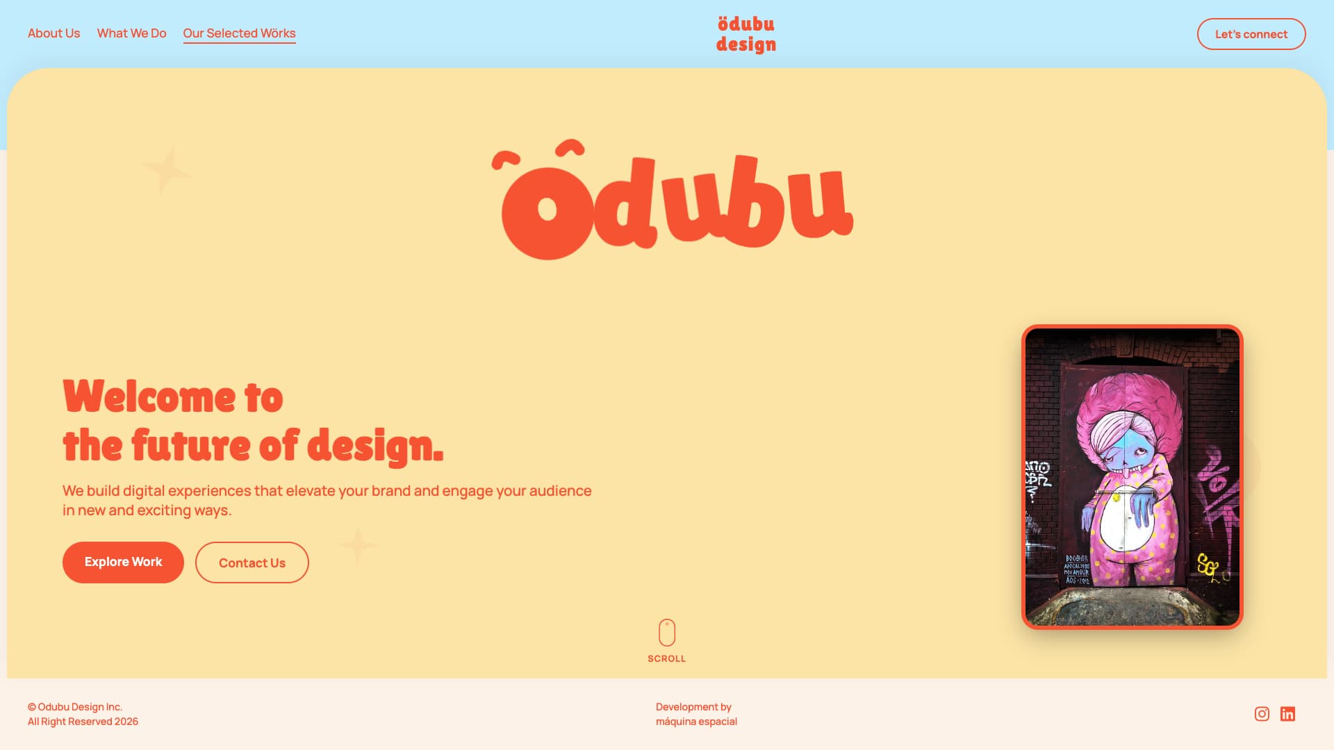
This Bit is an engaging, highly animated Hero Header section designed for creative agencies, studios, or personal portfolios. It combines playful character animation with modern layout techniques to create an unforgettable first impression.
Features
- Animated SVG Face (Ödubu): A custom SVG character integrated directly into the typographic logo. Powered by GSAP, the face seamlessly morphs between three distinct emotional states (happy, sad, excited) by animating the SVG path data.
- Tinder-Style Auto-Swiping Deck: A dynamic stack of image cards on the right side of the screen. Using GSAP and JavaScript, the top card automatically swipes away (alternating left and right) and returns to the back of the deck, creating an infinite 3D carousel effect.
- Vibrant Aesthetic: The card deck features colorful borders that cycle through the brand's primary colors (Orange, Purple, Lime Green), complementing the warm background gradient.
- SVG Scroll Indicator: A minimalist, custom-drawn SVG mouse icon at the bottom of the section with an infinite CSS keyframe animation simulating a scrolling wheel, encouraging users to scroll down.
- Fully Responsive: The layout uses Flexbox to perfectly stack the text and the card deck vertically on tablet and mobile devices, ensuring a flawless experience across all screen sizes.
Usage
This component relies on GSAP (GreenSock Animation Platform) for its advanced timeline and SVG path morphing animations. Ensure the GSAP CDN link is included in your project (already provided in the meta.json CDN links).
Technical Skills & Techniques Used
This Bit showcases advanced integration of CSS layouts and GSAP (GreenSock) JavaScript animations.
1. Advanced GSAP Timeline & Path Morphing
- SVG Path Animation: The facial expressions of the logo are animated by smoothly transitioning the
d attribute of SVG <path> elements. GSAP's timeline capabilities allow for complex, multi-stage morphing between predefined states (happy, sad, excited) with precise timing and easing.
- Array Management & 3D Stacking: The Tinder-style card deck logic manages an array of DOM elements. GSAP dynamically updates the
z-index, scale, y translation, and opacity based on each card's index in the array to create a convincing 3D stack perspective.
- Recursive Animation Loops: The
swipeCard function uses gsap.delayedCall to recursively trigger itself, creating an infinite, self-sustaining animation loop that handles both the outgoing swipe and the repositioning of the remaining cards.
2. Modern CSS Layouts & Styling
- CSS Perspective & 3D Transforms: The
.card-deck-container uses perspective: 1000px, allowing the internal cards to scale and translate along the Z and Y axes realistically.
- CSS Flexbox: Used extensively for the main structural layout (
.hero-content-wrapper), aligning the text block and the card deck, as well as centering internal elements like the scroll indicator.
- nth-child Styling: The colorful borders on the image deck are applied dynamically using CSS
:nth-child(3n+1) selectors, ensuring a repeating pattern of colors regardless of how many cards are added to the HTML.
3. Custom SVG Construction
- Inline SVGs: Both the animated face and the scroll mouse indicator are hand-coded inline SVGs. This allows their individual paths and shapes (like the mouse wheel) to be targeted directly via CSS classes or JS selectors for animation, something impossible with standard
<img> tags.
Design Decisions
Visual Concept
The design targets a playful, energetic, and highly creative aesthetic, perfect for a design agency or an innovative portfolio. It moves away from sterile, corporate looks and instead embraces organic shapes, warm colors, and constant motion to capture attention.
Color Palette
- Primary Orange (
#f55331): A high-energy, vibrant orange used for primary actions, the main typography, and accents. It commands attention and sets a bold, creative tone.
- Card Background (
#fce4a6): A warm, soft yellow that acts as the primary canvas for the hero section, contrasting beautifully with the orange text.
- Header & Footer Backgrounds (
#c1ecfd and #fdf2e8): Pastel blue and soft cream backgrounds that frame the main hero card, creating a layered, dimensional feel via CSS gradients.
- Accent Colors (Purple & Lime): Used dynamically on the Tinder card borders (
#8a2be2 and #ccff00) to inject unexpected bursts of color and break the monochromatic warmth.
Typography
- Lilita One: A thick, rounded, and highly playful display font used for the massive logo and the primary heading. It gives the brand a friendly, approachable voice.
- Manrope: A clean, geometric sans-serif font used for body copy and UI elements (navigation, buttons) to ensure legibility and provide balance against the heavy display font.
Layout & Interaction
- The "Card" Layout: The main hero content sits inside a massive white/yellow card with huge top border-radiuses (
60px), visually lifting the content off the background and creating a distinct "stage" for the animations.
- Split Layout (Desktop): A classic two-column layout on desktop balances the heavy typographic left side with the highly visual, animated card deck on the right.