<div class="gallery-container">
<div class="card">
<img draggable="false" src="https://images.unsplash.com/photo-1598046937785-122f499b2ab0?q=80&w=1740&auto=format&fit=crop&ixlib=rb-4.1.0&ixid=M3wxMjA3fDB8MHxwaG90by1wYWdlfHx8fGVufDB8fHx8fA%3D%3D"/>
</div>
<div class="card">
<img draggable="false" src="https://images.unsplash.com/photo-1762479883584-115f48f3c38b?q=80&w=3300&auto=format&fit=crop&ixlib=rb-4.1.0&ixid=M3wxMjA3fDB8MHxwaG90by1wYWdlfHx8fGVufDB8fHx8fA%3D%3D"/>
</div>
<div class="card">
<img draggable="false" src="https://images.unsplash.com/photo-1764885519030-9dc98ab1ee0f?q=80&w=1740&auto=format&fit=crop&ixlib=rb-4.1.0&ixid=M3wxMjA3fDB8MHxwaG90by1wYWdlfHx8fGVufDB8fHx8fA%3D%3D"/>
</div>
<div class="card">
<img draggable="false" src="https://images.unsplash.com/photo-1671073566591-c09ea1ff4428?q=80&w=3270&auto=format&fit=crop&ixlib=rb-4.1.0&ixid=M3wxMjA3fDB8MHxwaG90by1wYWdlfHx8fGVufDB8fHx8fA%3D%3D"/>
</div>
<div class="card">
<img draggable="false" src="https://images.unsplash.com/photo-1620059138674-24bdb08ef639?q=80&w=1742&auto=format&fit=crop&ixlib=rb-4.1.0&ixid=M3wxMjA3fDB8MHxwaG90by1wYWdlfHx8fGVufDB8fHx8fA%3D%3D"/>
</div>
<div class="card">
<img draggable="false" src="https://images.unsplash.com/photo-1593532847221-003b37578812?q=80&w=3270&auto=format&fit=crop&ixlib=rb-4.1.0&ixid=M3wxMjA3fDB8MHxwaG90by1wYWdlfHx8fGVufDB8fHx8fA%3D%3D"/>
</div>
</div>
/* BIT_CSS_START */
body {
  background-color: #fffefb;
  color: #605d52;
  font-family: 'Inter', sans-serif;
  -webkit-font-smoothing: antialiased;
  -moz-osx-font-smoothing: grayscale;
  overflow: hidden;
  height: 100vh;
  margin: 0;
  display: flex;
  align-items: center;
  justify-content: center;
  touch-action: none;
}

.gallery-container {
  perspective: 2000px;
  position: relative;
  width: 320px;
  height: 200px;
}

@media (min-width: 768px) {
  .gallery-container {
    width: 500px;
    height: 320px;
  }
}

.card {
  position: absolute;
  top: 0;
  left: 0;
  width: 100%;
  height: 100%;
  transform-style: preserve-3d;
  backface-visibility: hidden;
  will-change: transform, opacity;

  border-radius: 2rem;
  background-color: #ffffff;
  box-shadow: 0 25px 50px -12px rgba(0, 0, 0, 0.25);
  overflow: hidden;
  border: 1px solid rgba(0, 0, 0, 0.05);
}

.card img {
  width: 100%;
  height: 100%;
  object-fit: cover;
}

/* BIT_CSS_END */
let cards = gsap.utils.toArray(".card");
const container = document.querySelector('.gallery-container');
let isAnimating = false;

// Configuración de la pila (Escalera hacia atrás)
function setupStack(isInitial = false) {
  cards.forEach((card, i) => {
    // Si es la tarjeta que está entrando atrás, no forzamos su opacidad
    const entering = card.getAttribute('data-entering') === 'true';

    gsap.to(card, {
      duration: isInitial ? 0 : 0.6,
      ease: "expo.out",
      zIndex: cards.length - i,
      y: i * -22,
      z: i * -60,
      scale: 1 - (i * 0.05),
      rotationX: 0,
      opacity: entering ? 0 : 1 // Mantenemos invisible si está entrando
    });
  });
}

setupStack(true);

function nextCard() {
  if (isAnimating) return;
  isAnimating = true;

  const topCard = cards[0];
  const tl = gsap.timeline({
    onComplete: () => {
      // 1. Reordenar Array
      const movedCard = cards.shift();

      // 2. Marcamos la tarjeta como "entrante" (limbo) y totalmente invisible
      movedCard.setAttribute('data-entering', 'true');
      gsap.set(movedCard, {
        opacity: 0,
        rotationX: 0,
        y: (cards.length - 1) * -22,
        z: (cards.length - 1) * -60,
        scale: 1 - ((cards.length - 1) * 0.05)
      });

      // 3. Mover físicamente en el DOM al final (ya es invisible y está posicionada)
      cards.push(movedCard);
      container.appendChild(movedCard);

      // 4. Actualizar posiciones de las demás y fade in de la nueva
      setupStack();

      // Revelación lenta atrás
      gsap.to(movedCard, {
        opacity: 1,
        duration: 0.8,
        ease: "power2.out",
        onComplete: () => {
          movedCard.removeAttribute('data-entering'); // Quitamos la marca
          isAnimating = false;
        }
      });
    }
  });

  // Animación: La de adelante cae hacia el frente
  tl.to(topCard, {
    duration: 0.7,
    rotationX: -90,
    y: 350,
    z: 200,
    opacity: 0,
    ease: "power2.inOut"
  }, 0);

  // Las de atrás avanzan un paso
  cards.slice(1).forEach((card, i) => {
    tl.to(card, {
      duration: 0.7,
      y: i * -22,
      z: i * -60,
      scale: 1 - (i * 0.05),
      ease: "power2.inOut"
    }, 0.05);
  });
}

// --- Eventos (Scroll, Click, Touch) ---
window.addEventListener('wheel', (e) => {
  if (e.deltaY > 0) nextCard();
}, {
  passive: true
});

container.addEventListener('click', nextCard);

let touchStartY = 0;
window.addEventListener('touchstart', (e) => touchStartY = e.touches[0].clientY);
window.addEventListener('touchmove', (e) => {
  let touchEndY = e.touches[0].clientY;
  if (touchStartY - touchEndY > 50) {
    nextCard();
    touchStartY = touchEndY;
  }
});
3D Scroll Card Gallery
Overview
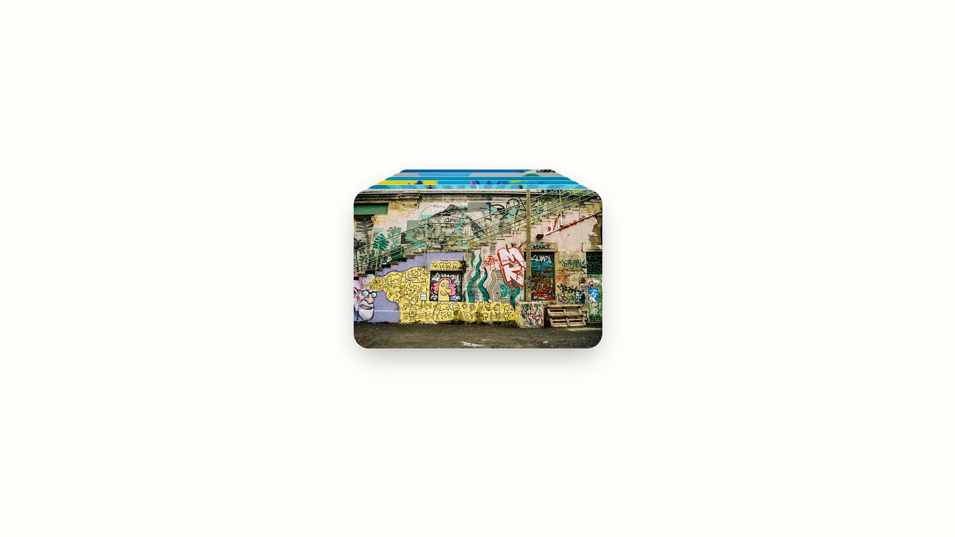
This is a highly interactive, 3D scrolling image gallery designed for portfolios or photography showcases. It leverages the GreenSock Animation Platform (GSAP) to create a smooth, stacked card scrolling effect where cards reveal themselves in a 3D perspective as the user scrolls or drags.
Features
- GSAP ScrollTrigger Animation: Smoothly scrolls through a stack of image cards with dynamic depth.
- Pure Vanilla CSS: Fully styled without the need for CSS frameworks like Tailwind, ensuring maximum portability and clean HTML structure.
- Responsive Design: The gallery container adjusts its 3D perspective and sizing based on screen dimensions, ensuring a great experience on both mobile and desktop.
Technical Skills & Modern Web Techniques Used
This component showcases advanced frontend animation and layout techniques:
- CSS 3D Transforms:
perspective: 2000px: Applied to the parent container to establish a 3D space for the children.transform-style: preserve-3d: Ensures the cards render their 3D transforms correctly in relation to each other.-
backface-visibility: hidden: Improves rendering performance and prevents visual glitches when cards overlap in 3D space.
-
Vanilla CSS Architecture:
-
Successfully refactored from a TailwindCSS dependency to pure CSS. Highlights the ability to recreate complex utility shadows (like shadow-2xl) and flexible layouts using standard web properties, keeping the HTML markup clean and semantic.
-
Performance Optimization:
-
will-change: transform, opacity: Hints the browser to create hardware-accelerated layers for the cards, guaranteeing that the GSAP scroll animations run at a buttery smooth 60fps even on lower-end devices.
-
GSAP Integration:
- Uses the GSAP core library to handle complex staggered 3D animations that would be incredibly tedious to write manually with standard CSS keyframes.
Design Decisions: 3D Scroll Card
Visual Aesthetics
- Clean Canvas: The background (
#fffefb) and text colors (#605d52) are soft and muted, ensuring the photography within the cards remains the absolute focal point of the interface.
- Card Styling: The cards feature a massive border-radius (
2rem) and a deep, soft shadow (0 25px 50px -12px rgba(0, 0, 0, 0.25)). This extreme rounding and depth creates a tactile, physical card feel that enhances the 3D scroll effect.
- Typography: Uses the clean geometric sans-serif
Inter as a base, with Instrument Serif available for elegant headings to provide a sophisticated editorial feel.
Layout & Composition
- Center Focus: The entire gallery is anchored perfectly to the center of the viewport using Flexbox, preventing any distracting scrolling on the body.
- 3D Depth: The container utilizes
perspective: 2000px to give the GSAP Z-axis transformations a realistic, deep vanishing point.