<div class="loading" id="app-container">
 <!-- Tall invisible container to provide scrollable space -->
 <div class="scroll-content" style="height: 600vh;">
 </div>
 <!-- Full-screen fixed scene -->
 <div id="scene">
  <!-- Background layer -->
  <div class="backgrounds">
   <div class="bg-img bg-1" style="background-image: url('https://storage.maquinaespacial.com/templates/saturn/media/ART-18.jpg');">
   </div>
   <div class="bg-img bg-2" style="background-image: url('https://storage.maquinaespacial.com/templates/saturn/media/ART-19.jpg');">
   </div>
   <div class="bg-img bg-3" style="background-image: url('https://storage.maquinaespacial.com/templates/saturn/media/ART-20.jpg');">
   </div>
   <div class="bg-img bg-4" style="background-image: url('https://storage.maquinaespacial.com/templates/saturn/media/ART-21.jpg');">
   </div>
   <div class="bg-img bg-5" style="background-image: url('https://storage.maquinaespacial.com/templates/saturn/media/ART-22.jpg');">
   </div>
   <div class="bg-img bg-6" style="background-image: url('https://storage.maquinaespacial.com/templates/saturn/media/ART-23.jpg');">
   </div>
  </div>
  <!-- Dark overlay to make cube/text pop -->
  <div class="background-overlay">
  </div>
  <!-- Text Layer -->
  <div class="typography">
   <div class="title-wrap">
    <h2 class="title title-1">
     Saki Nishimura
    </h2>
   </div>
   <div class="title-wrap">
    <h2 class="title title-2">
     Reina Endo
    </h2>
   </div>
   <div class="title-wrap">
    <h2 class="title title-3">
     Yuna Fujita
    </h2>
   </div>
   <div class="title-wrap">
    <h2 class="title title-4">
     Kana Sakurai
    </h2>
   </div>
   <div class="title-wrap">
    <h2 class="title title-5">
     Ayaka Mizuno
    </h2>
   </div>
   <div class="title-wrap">
    <h2 class="title title-6">
     Reina Takagi
    </h2>
   </div>
  </div>
  <!-- 3D Cube Layer -->
  <div class="cube-wrapper">
   <div class="cube-spinner">
    <div class="cube">
     <div class="cube__face cube__face--front">
      <img alt="1" src="https://storage.maquinaespacial.com/templates/saturn/media/ART-18.jpg"/>
     </div>
     <div class="cube__face cube__face--right">
      <img alt="2" src="https://storage.maquinaespacial.com/templates/saturn/media/ART-19.jpg"/>
     </div>
     <div class="cube__face cube__face--back">
      <img alt="3" src="https://storage.maquinaespacial.com/templates/saturn/media/ART-20.jpg"/>
     </div>
     <div class="cube__face cube__face--left">
      <img alt="4" src="https://storage.maquinaespacial.com/templates/saturn/media/ART-21.jpg"/>
     </div>
     <div class="cube__face cube__face--top">
      <img alt="5" src="https://storage.maquinaespacial.com/templates/saturn/media/ART-22.jpg"/>
     </div>
     <div class="cube__face cube__face--bottom">
      <img alt="6" src="https://storage.maquinaespacial.com/templates/saturn/media/ART-23.jpg"/>
     </div>
    </div>
   </div>
  </div>
 </div>
</div>
/* BIT_CSS_START */
*,
*::after,
*::before {
  box-sizing: border-box;
}

:root {
  --color-text: #ffffff;
  --color-bg: #000000;
  --cube-size: 25vmin;
  --cube-half: calc(var(--cube-size) / 2);
}

@media (max-width: 768px) {
  :root {
    --cube-size: 40vmin;
  }
}

html,
body {
  height: auto !important;
  min-height: 100%;
}

body {
  margin: 0;
  color: var(--color-text);
  background-color: var(--color-bg);
  font-family: 'Inter', sans-serif;
  overflow-x: hidden;
}

#app-container {
  width: 100%;
  position: relative;
}

.scroll-content {
  width: 100%;
  /* Height is set in HTML to 600vh to give scroll room */
}

#scene {
  position: fixed;
  top: 0;
  left: 0;
  width: 100vw;
  height: 100vh;
  height: 100dvh;
  overflow: hidden;
  display: flex;
  align-items: center;
  justify-content: center;
}

/* Background Images Layer */
.backgrounds {
  position: absolute;
  top: 0;
  left: 0;
  width: 100%;
  height: 100%;
  z-index: 1;
}

.bg-img {
  position: absolute;
  top: 0;
  left: 0;
  width: 100%;
  height: 100%;
  background-size: cover;
  background-position: center;
  opacity: 0;
  will-change: opacity, transform;
  transform: scale(1.1);
  /* Subtle zoom effect */
}

.bg-img.bg-1 {
  opacity: 1;
  transform: scale(1);
}

/* Default active */

/* Dark Overlay to make content pop */
.background-overlay {
  position: absolute;
  top: 0;
  left: 0;
  width: 100%;
  height: 100%;
  background-color: rgba(0, 0, 0, 0.6);
  z-index: 2;
}

/* Typography Layer */
.typography {
  position: absolute;
  top: 50%;
  left: 50%;
  transform: translate(-50%, -50%);
  width: 100%;
  text-align: center;
  z-index: 3;
  pointer-events: none;
}

.title-wrap {
  position: absolute;
  top: 50%;
  left: 50%;
  transform: translate(-50%, -50%);
  width: 100%;
}

.title {
  margin: 0;
  font-family: 'League Gothic', sans-serif;
  font-size: clamp(4rem, 15vw, 12rem);
  text-transform: uppercase;
  line-height: 1;
  letter-spacing: 0.05em;
  opacity: 0;
  transform: translateY(50px);
  will-change: opacity, transform;
}

.title-1 {
  opacity: 1;
  transform: translateY(0);
}

/* 3D Cube Geometry Layer */
.cube-wrapper {
  position: relative;
  width: var(--cube-size);
  height: var(--cube-size);
  perspective: 2000px;
  z-index: 4;
}

.cube-spinner {
  width: 100%;
  height: 100%;
  transform-style: preserve-3d;
  will-change: transform;
}

.cube {
  width: 100%;
  height: 100%;
  position: relative;
  transform-style: preserve-3d;
  transform: translateZ(calc(var(--cube-half) * -1));
}

.cube__face {
  position: absolute;
  width: var(--cube-size);
  height: var(--cube-size);
  left: 0;
  top: 0;
  overflow: hidden;
  box-shadow: 0 0 40px rgba(0, 0, 0, 0.5);
  border-radius: 8px;
  /* Optional slight rounding */
}

.cube__face img {
  width: 100%;
  height: 100%;
  object-fit: cover;
  display: block;
}

/* Position the 6 faces */
.cube__face--front {
  transform: rotateY(0deg) translateZ(var(--cube-half));
}

.cube__face--right {
  transform: rotateY(90deg) translateZ(var(--cube-half));
}

.cube__face--back {
  transform: rotateY(180deg) translateZ(var(--cube-half));
}

.cube__face--left {
  transform: rotateY(-90deg) translateZ(var(--cube-half));
}

.cube__face--top {
  transform: rotateX(90deg) translateZ(var(--cube-half));
}

.cube__face--bottom {
  transform: rotateX(-90deg) translateZ(var(--cube-half));
}

/* Loading State */
.loading::before {
  content: "";
  position: fixed;
  top: 0;
  left: 0;
  width: 100%;
  height: 100%;
  background: #000;
  z-index: 10000;
}

.loading::after {
  content: "LOADING";
  position: fixed;
  top: 50%;
  left: 50%;
  transform: translate(-50%, -50%);
  color: #fff;
  font-family: 'League Gothic', sans-serif;
  font-size: 2rem;
  letter-spacing: 0.2em;
  z-index: 10001;
  animation: pulse 1s infinite alternate;
}

@keyframes pulse {
  0% {
    opacity: 0.3;
  }

  100% {
    opacity: 1;
  }
}

/* BIT_CSS_END */
gsap.registerPlugin(ScrollTrigger);

let lenis;

function initLenis() {
  lenis = new Lenis({
    duration: 1.2,
    easing: (t) => Math.min(1, 1.001 - Math.pow(2, -10 * t)),
    smoothWheel: true
  });

  lenis.on('scroll', ScrollTrigger.update);

  gsap.ticker.add((time) => {
    lenis.raf(time * 1000);
  });
  gsap.ticker.lagSmoothing(0);
}

function initGallery() {
  const tl = gsap.timeline({
    scrollTrigger: {
      trigger: ".scroll-content",
      start: "top top",
      end: "bottom bottom",
      scrub: 1
    }
  });

  // The 6 states to reveal each face in sequence, and move the cube around the center.
  // 1. Front (Left)
  // 2. Right (Top)
  // 3. Back (Right)
  // 4. Left (Bottom)
  // 5. Top (Left)
  // 6. Bottom (Top)
  const states = [{
    rx: 0,
    ry: 0,
    x: "-30vw",
    y: "0vh"
  }, {
    rx: 0,
    ry: -90,
    x: "0vw",
    y: "-30vh"
  }, {
    rx: 0,
    ry: -180,
    x: "30vw",
    y: "0vh"
  }, {
    rx: 0,
    ry: -270,
    x: "0vw",
    y: "30vh"
  }, {
    rx: -90,
    ry: -360,
    x: "-30vw",
    y: "0vh"
  }, {
    rx: 90,
    ry: -360,
    x: "0vw",
    y: "-30vh"
  }];

  // Make sure we start at state 0
  gsap.set(".cube-spinner", {
    rotationX: 0,
    rotationY: 0
  });
  gsap.set(".cube-wrapper", {
    x: states[0].x,
    y: states[0].y
  });

  for (let i = 0; i < 5; i++) {
    const nextState = states[i + 1];

    // Animate Cube Rotation
    tl.to(".cube-spinner", {
      rotationX: nextState.rx,
      rotationY: nextState.ry,
      ease: "power2.inOut",
      duration: 1
    }, i);

    // Animate Cube Translation (Orbiting the center)
    tl.to(".cube-wrapper", {
      x: nextState.x,
      y: nextState.y,
      ease: "power2.inOut",
      duration: 1
    }, i);

    // Crossfade Backgrounds
    tl.to(`.bg-${i+1}`, {
      opacity: 0,
      scale: 1.15,
      duration: 1,
      ease: "power2.inOut"
    }, i);
    tl.fromTo(`.bg-${i+2}`, {
      opacity: 0,
      scale: 1.05
    }, {
      opacity: 1,
      scale: 1,
      duration: 1,
      ease: "power2.inOut"
    }, i);

    // Text Transitions (Fade up and out)
    tl.to(`.title-${i+1}`, {
      opacity: 0,
      y: -50,
      duration: 0.5,
      ease: "power2.in"
    }, i);
    tl.fromTo(`.title-${i+2}`, {
      opacity: 0,
      y: 50
    }, {
      opacity: 1,
      y: 0,
      duration: 0.5,
      ease: "power2.out"
    }, i + 0.5);
  }
}

const preloadImages = () => {
  return new Promise((resolve) => {
    const imgs = document.querySelectorAll('.cube__face img');
    if (imgs.length === 0) {
      resolve();
      return;
    }
    imagesLoaded(imgs, resolve);
    // Fallback in case imagesLoaded hangs
    setTimeout(resolve, 3000);
  });
};

function startApp() {
  preloadImages().then(() => {
    const app = document.getElementById('app-container');
    if (app) app.classList.remove('loading');
    initLenis();
    initGallery();
  }).catch(err => {
    console.error("Images loaded error:", err);
    initLenis();
    initGallery();
  });
}

if (document.readyState === 'loading') {
  document.addEventListener('DOMContentLoaded', startApp);
} else {
  startApp();
}
Skills & Techniques Used
- CSS Preserve-3D: Utilizes
perspective: 2000px on a wrapper and transform-style: preserve-3d on the child.
- Calculated Z-Translation: The faces are pushed out by
calc(var(--cube-size) / 2) to form a perfect cube regardless of viewport size.
- Mathematical GSAP Tumbling:
- To transition between faces smoothly, we plot a rotational path:
Y: 0 -> Y: -90 -> Y: -180 -> Y: -270.
- To reveal the Top face smoothly from the Left face (
Y: -270), we push Y to -360 (returning to 0 visually) while pushing X to -90 (tilting the cube forward).
- To reveal the Bottom face, we keep
Y at -360 and push X from -90 to 90 (a 180-degree vertical flip).
- Orbital GSAP Translation: We animate
x and y via GSAP concurrently with the rotation. Using viewport units (-30vw, -30vh), the cube draws a diamond orbit perfectly tied to scroll progress.
- GSAP Scrub Timeline: A single
scrollTrigger timeline loops over these states, triggering crossfades on .bg-img and .title using staggered offsets (i + 0.5) to ensure text appears precisely when the cube locks into orbit.
Design Decisions
3D Orbital Focus
By shrinking the cube (25vmin) and animating its x and y properties to orbit the screen (Left -> Top -> Right -> Bottom), we solve a major UI issue: overlap. The moving cube creates a highly dynamic spatial relationship with the viewer, while leaving the center completely unobstructed.
Background Depth
To ensure the 3D cube and the typography pop, the background images are heavily darkened (rgba(0, 0, 0, 0.6)) and slightly zoomed (scale(1.15) fading into scale(1.0)). This cinematic technique grounds the 3D element against a moody 2D plane.
Cinematic Typography
The design uses League Gothic at a massive font scale (clamp(4rem, 15vw, 12rem)) with text-transform: uppercase. Positioned dead center, it evokes an editorial feeling akin to an art exhibit, acting as the structural anchor while the cube dances around it.
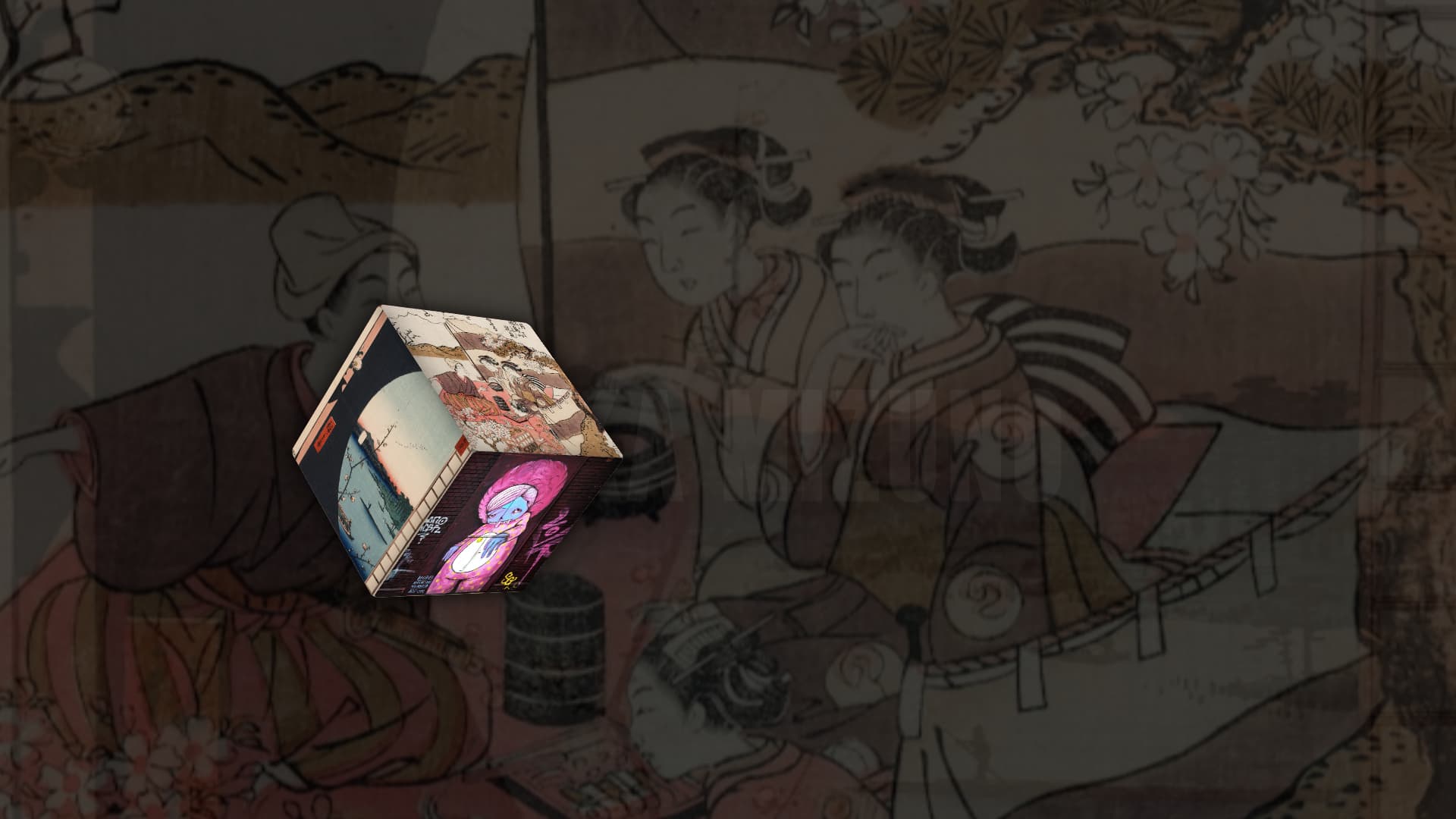
Orbital 3D Scroll Cube Gallery
This bit is a highly customized recreation of the popular Codrops tutorial on building a Webflow GSAP cube, completely rewritten in Vanilla HTML, CSS, and JS.
The experience leverages transform-style: preserve-3d to map 6 images onto the faces of a mathematically perfect 3D cube. As you scroll, GSAP ScrollTrigger scrubs through a timeline that not only tumbles the cube in 3D space (transitioning between Front, Right, Back, Left, Top, and Bottom faces) but also orbits the cube around the edges of the screen to leave the center completely clear for typography.
Features
- True 3D Geometry: The cube isn't just a 2D illusion. It is a genuine 3D CSS object rotated along
X and Y axes with a calculated translateZ.
- Orbital Translation: The cube dynamically moves across the screen (
x and y coordinates) in a diamond pattern, preventing it from obscuring the titles.
- Scroll Synchronization: The background layer crossfades to match the currently viewed cube face, and large typography slides into place perfectly in sync with the cube.
- Buttery Smooth: Powered by
Lenis smooth scrolling and GSAP 60fps animations.