<div class="pixel-cards-wrapper">
 <section class="pixel-cards-grid">
  <!-- Card 1 -->
  <div class="pixel-card card-white">
   <div class="card-graphic graphic-full">
    <canvas class="pixel-canvas" data-color="#ff4a00" data-shape="wave">
    </canvas>
   </div>
   <div class="card-content flex-col-between">
    <div class="spacer">
    </div>
    <div>
     <div class="logo-icon text-black mb-4">
      <svg fill="currentColor" height="24" viewbox="0 0 24 24" width="24">
       <path d="M4 8h16v2H4zm0 6h16v2H4z">
       </path>
      </svg>
     </div>
     <h2 class="serif-title text-black">
      Engineering
      <br/>
      Systems That Think
      <br/>
      Clearly.
     </h2>
    </div>
   </div>
  </div>
  <!-- Card 2 -->
  <div class="pixel-card card-blue">
   <div class="card-graphic graphic-full">
    <canvas class="pixel-canvas" data-color="#8ba2ff" data-shape="pill">
    </canvas>
   </div>
   <div class="card-content flex-col-between">
    <h2 class="sans-title text-blue-dark">
     Turning
     <br/>
     Complexity into
     <br/>
     Usable
     <br/>
     Systems.
    </h2>
    <div class="logo-and-text">
     <div class="logo-icon text-white mb-4">
      <svg fill="currentColor" height="24" viewbox="0 0 24 24" width="24">
       <path d="M4 8h16v2H4zm0 6h16v2H4z">
       </path>
      </svg>
     </div>
     <p class="small-text text-white">
      We research, prototype, and deploy technology that works in the real world not just demos.
     </p>
    </div>
   </div>
  </div>
  <!-- Card 3 -->
  <div class="pixel-card card-dark">
   <div class="card-graphic graphic-full">
    <canvas class="pixel-canvas" data-color="#ccff00" data-shape="sphere">
    </canvas>
   </div>
   <div class="card-content flex-col-between">
    <div class="spacer">
    </div>
    <div>
     <div class="logo-icon text-lime mb-4">
      <svg fill="currentColor" height="24" viewbox="0 0 24 24" width="24">
       <path d="M4 8h16v2H4zm0 6h16v2H4z">
       </path>
      </svg>
     </div>
     <h2 class="sans-title text-white">
      Architecting
      <br/>
      Data For Scale.
     </h2>
     <p class="small-text text-gray">
      Our infrastructure handles millions of events per second with zero latency.
     </p>
    </div>
   </div>
  </div>
  <!-- Card 4 -->
  <div class="pixel-card card-purple">
   <div class="card-graphic graphic-full">
    <canvas class="pixel-canvas" data-color="#ffffff" data-shape="flow">
    </canvas>
   </div>
   <div class="card-content flex-col-between">
    <h2 class="sans-title text-lime">
     Designing
     <br/>
     the Next Era
     <br/>
     of Web.
    </h2>
    <div class="logo-and-text">
     <div class="logo-icon text-lime mb-4">
      <svg fill="currentColor" height="24" viewbox="0 0 24 24" width="24">
       <path d="M4 8h16v2H4zm0 6h16v2H4z">
       </path>
      </svg>
     </div>
     <p class="small-text text-lime">
      We prioritize human-centric experiences backed by solid computational logic.
     </p>
    </div>
   </div>
  </div>
 </section>
</div>
/* BIT_CSS_START */
@import url('https://fonts.googleapis.com/css2?family=Helvetica+Neue:wght@400;500;700&display=swap');

:root {
  --bg-main: #f2f3f7;
}

body {
  font-family: 'Helvetica Neue', Helvetica, Arial, sans-serif;
  background-color: var(--bg-main);
  margin: 0;
  padding: 0;
}

/* Container */
.pixel-cards-wrapper {
  display: flex;
  align-items: center;
  justify-content: center;
  width: 100%;
  min-height: 100vh;
}

.pixel-cards-grid {
  display: grid;
  grid-template-columns: repeat(4, 1fr);
  gap: 20px;
  width: 100%;
  max-width: 1400px;
  padding: 40px;
}

/* Cards */
.pixel-card {
  position: relative;
  height: 520px;
  border-radius: 4px;
  overflow: hidden;
  display: flex;
  flex-direction: column;
  box-shadow: 0 4px 20px rgba(0, 0, 0, 0.05);
}

.card-white {
  background-color: #ffffff;
}

.card-blue {
  background: linear-gradient(to bottom, #e2ebf8 38%, #1751f2 38%);
}

.card-dark {
  background-color: #111827;
}

.card-purple {
  background-color: #7c3aed;
}

/* Colors */
.text-black {
  color: #111111;
}

.text-white {
  color: #ffffff;
}

.text-blue-dark {
  color: #1751f2;
}

.text-gray {
  color: #9ca3af;
  margin-top: 15px;
}

.text-lime {
  color: #ccff00;
}

.card-content {
  position: relative;
  padding: 30px;
  flex: 1;
  display: flex;
  flex-direction: column;
  z-index: 2;
}

.flex-col-between {
  justify-content: space-between;
}

.mb-4 {
  margin-bottom: 16px;
}

.logo-and-text {
  display: flex;
  flex-direction: column;
  max-width: 80%;
}

/* Typography */
.serif-title {
  font-family: 'Times New Roman', Times, serif;
  font-size: 2.6rem;
  font-weight: 400;
  line-height: 1.05;
  letter-spacing: -0.02em;
  margin: 0;
}

.sans-title {
  font-size: 2.6rem;
  font-weight: 500;
  line-height: 1.05;
  letter-spacing: -0.04em;
  margin: 0;
}

.small-text {
  font-size: 0.9rem;
  line-height: 1.4;
  margin: 0;
}

/* Graphics Positioning */
.card-graphic {
  position: absolute;
  top: 0;
  left: 0;
  width: 100%;
  height: 100%;
  z-index: 1;
  pointer-events: none;
}

.pixel-canvas {
  width: 100%;
  height: 100%;
  display: block;
}

/* Responsive */
@media (max-width: 1200px) {
  .pixel-cards-grid {
    grid-template-columns: repeat(2, 1fr);
  }
}

@media (max-width: 600px) {
  .pixel-cards-grid {
    grid-template-columns: 1fr;
    padding: 20px;
  }

  .pixel-card {
    height: 480px;
  }
}

/* BIT_CSS_END */
// BIT_JS_START
document.addEventListener('DOMContentLoaded', () => {
  const canvases = document.querySelectorAll('.pixel-canvas');

  // 2D Value Noise Function
  function hash(x, y) {
    return Math.abs(Math.sin(x * 12.9898 + y * 78.233) * 43758.5453) % 1;
  }

  function noise(x, y) {
    const ix = Math.floor(x);
    const iy = Math.floor(y);
    const fx = x - ix;
    const fy = y - iy;

    const sx = fx * fx * (3 - 2 * fx);
    const sy = fy * fy * (3 - 2 * fy);

    const n00 = hash(ix, iy);
    const n10 = hash(ix + 1, iy);
    const n01 = hash(ix, iy + 1);
    const n11 = hash(ix + 1, iy + 1);

    const nx0 = n00 * (1 - sx) + n10 * sx;
    const nx1 = n01 * (1 - sx) + n11 * sx;

    return nx0 * (1 - sy) + nx1 * sy;
  }

  // Fractal Brownian Motion for fluid organic look
  function fbm(x, y) {
    let val = 0;
    let amp = 0.5;
    let freq = 1;
    for (let i = 0; i < 3; i++) {
      val += amp * noise(x * freq, y * freq);
      amp *= 0.5;
      freq *= 2;
    }
    return val;
  }

  canvases.forEach(canvas => {
    const ctx = canvas.getContext('2d');
    let width, height;

    const shape = canvas.dataset.shape;
    const color = canvas.dataset.color;
    const pxSize = 5; // Size of each pixel square
    let time = Math.random() * 100; // Random start time for each

    function resize() {
      width = canvas.parentElement.clientWidth;
      height = canvas.parentElement.clientHeight;
      // Handle high DPI displays for crisp pixels
      const dpr = window.devicePixelRatio || 1;
      canvas.width = width * dpr;
      canvas.height = height * dpr;
      ctx.scale(dpr, dpr);
    }

    window.addEventListener('resize', resize);
    resize();

    function draw() {
      ctx.clearRect(0, 0, width, height);
      ctx.fillStyle = color;

      const cols = Math.floor(width / pxSize);
      const rows = Math.floor(height / pxSize);

      for (let i = 0; i < cols; i++) {
        for (let j = 0; j < rows; j++) {
          const x = i * pxSize;
          const y = j * pxSize;

          // Compute noise
          const scale = 0.02;
          const n = fbm(x * scale + time * 0.4, y * scale - time * 0.2);

          let drawPixel = false;

          if (shape === 'wave') {
            // Fill more at top left, cascading down to right
            const gradient = y / height;
            const threshold = 0.25 + gradient * 0.65;
            drawPixel = n > threshold;
          } else if (shape === 'pill') {
            // Vertical capsule on right
            const cx = width * 0.85;
            const cy = height * 0.65;
            const dx = Math.abs(x - cx);
            const dy = Math.abs(y - cy);
            let dist = 0;
            if (dy < height * 0.2) dist = dx;
            else dist = Math.hypot(dx, dy - height * 0.2);

            const threshold = 0.25 + (dist * 0.012);
            drawPixel = n > threshold;
          } else if (shape === 'sphere') {
            // Sphere at top center
            const cx = width * 0.5;
            const cy = height * 0.15;
            const dist = Math.hypot(x - cx, y - cy);
            const threshold = 0.2 + (dist * 0.006);
            drawPixel = n > threshold;
          } else if (shape === 'flow') {
            // Diagonal flow
            const gradient = (x + y) / (width + height);
            const threshold = 0.35 + gradient * 0.3;
            drawPixel = n > threshold;
          }

          if (drawPixel) {
            ctx.fillRect(x, y, pxSize, pxSize);
          }
        }
      }

      time += 0.04;
      requestAnimationFrame(draw);
    }

    draw();
  });
});
// BIT_JS_END
Technical Skills & Techniques Used
This Bit showcases highly advanced mathematical implementations inside Vanilla JavaScript for creative coding.
1. Canvas API & Procedural Generation
- Fractal Brownian Motion (FBM): The fluid, liquid-like motion of the pixels is not random noise. It uses FBM, a mathematical technique that stacks multiple octaves of noise at varying frequencies and amplitudes to generate highly organic, cloud-like patterns.
- 2D Value Noise: Since JavaScript lacks a built-in continuous noise function (like Perlin Noise), a custom 2D Value Noise algorithm was implemented from scratch using deterministic hashing. This ensures the fluid animation is perfectly smooth without chaotic flickering.
- Algorithmic Masking: The distinct shapes (Wave, Pill, Sphere, Diagonal Flow) are not drawn via images; they are mathematically defined inside the Canvas render loop by combining geometric distance functions (
Math.hypot, coordinate offsets) with the FBM noise threshold.
2. Advanced CSS Layouts
- CSS Grid: Utilized for the main
.pixel-cards-grid structure, using grid-template-columns: repeat(4, 1fr) to effortlessly create fluid, equal-width columns that break down gracefully at specific media queries.
- Split Backgrounds: The background of Card 2 uses a hard-stop CSS
linear-gradient (linear-gradient(to bottom, #e2ebf8 38%, #1751f2 38%)) to create a perfectly crisp two-tone layout without needing extra HTML wrappers.
- Absolute Viewport Centering: The wrapper uses
min-height: 100vh, display: flex, and align-items: center to ensure the entire component acts as a perfectly centered, full-screen landing page section.
Design Decisions
Visual Concept
The design targets a "cutting-edge technology" aesthetic. It heavily draws inspiration from brutalism and modern editorial design, mixing stark geometric layouts with highly organic, mathematical animations. The goal is to convey complexity turning into simplicity.
Color Palette
- Stark Contrasts: The grid relies on extreme color contrasts between the cards to establish visual hierarchy and keep the user's eye moving.
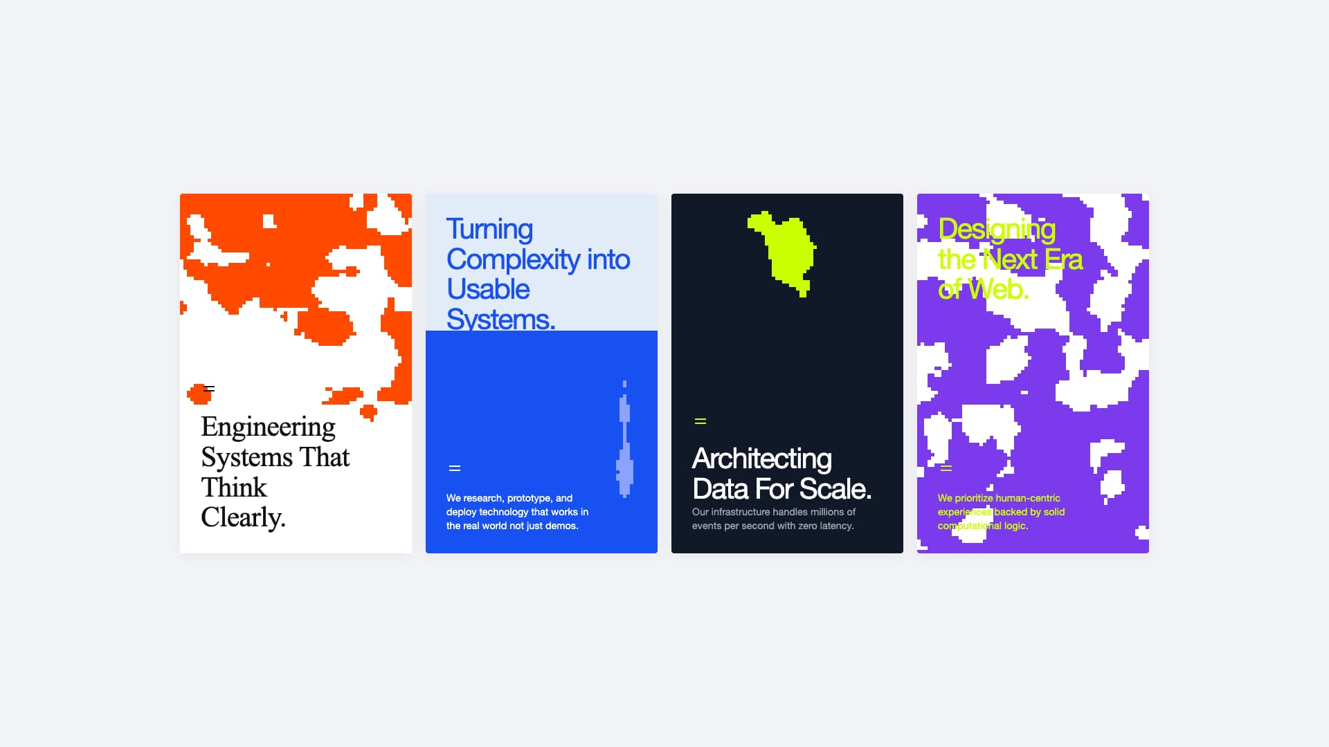
- Card 1 (Classic Tech): Pure White (
#ffffff) background paired with a harsh Orange (#ff4a00) pixel wave.
- Card 2 (Corporate Modern): A split gradient using Soft Grey-Blue (
#e2ebf8) and Royal Blue (#1751f2).
- Card 3 (Cyber/Infrastructure): Deep Space Grey (
#111827) paired with a vibrant Neon Lime (#ccff00).
- Card 4 (Future Web): Deep Purple (
#7c3aed) contrasted entirely with the aforementioned Neon Lime for extreme legibility and a futuristic pop.
Typography
- Helvetica Neue: Used as the primary sans-serif typeface to maintain a clinical, Swiss-design neutrality that lets the aggressive colors and animations shine.
- Times New Roman: Used exclusively on Card 1 to introduce a sophisticated, editorial contrast against the raw digital aesthetic of the pixels.
Fluid Pixel Animated Cards
This Bit is a highly modern, 4-card responsive grid section designed for landing pages that require a cutting-edge, tech-forward aesthetic. It features four distinct cards, each with a unique mathematical fluid pixel animation running seamlessly in the background.
Features
- Algorithmic Fluid Pixels: Instead of relying on heavy videos or GIFs, the animated pixel blocks are generated in real-time using an HTML5
<canvas> and vanilla JavaScript mathematics. The fluid motion is achieved using a custom 2D Value Noise function combined with Fractal Brownian Motion (FBM), resulting in organic, non-repeating, and non-flickering pixel flows.
- Four Unique Styles:
- Card 1: A clean white card with an orange fluid wave and classic Serif typography.
- Card 2: A split-background blue card featuring a dynamic vertical "pill" of pixels.
- Card 3: A dark futuristic card with a neon-lime pixel sphere at the top center.
- Card 4: A deep purple card with a stark, high-contrast neon-lime text overlay and a diagonal white pixel flow.
- Fully Centered Layout: The entire grid is wrapped in a flexbox container (
100vh), ensuring it perfectly dead-centers both vertically and horizontally in any viewport.
- Responsive Grid: Seamlessly transitions from a 4-column layout on desktop, to 2-columns on tablets, and a 1-column vertical stack on mobile devices.
Usage
This component relies strictly on Vanilla JavaScript and CSS. It requires zero external libraries or dependencies.